-
Financial reporting and accounting advisory services
You trust your external auditor to deliver not only a high-quality, independent audit of your financial statements but to provide a range of support, including assessing material risks, evaluating internal controls and raising awareness around new and amended accounting standards.
-
Accounting Standards for Private Enterprises
Get the clear financial picture you need with the accounting standards team at Doane Grant Thornton LLP. Our experts have extensive experience with private enterprises of all sizes in all industries, an in-depth knowledge of today’s accounting standards, and are directly involved in the standard-setting process.
-
International Financial Reporting Standards
Whether you are already using IFRS or considering a transition to this global framework, Doane Grant Thornton LLP’s accounting standards team is here to help.
-
Accounting Standards for Not-for-Profit Organizations
From small, community organizations to large, national charities, you can count on Doane Grant Thornton LLP’s accounting standards team for in-depth knowledge and trusted advice.
-
Public Sector Accounting Standards
Working for a public-sector organization comes with a unique set of requirements for accounting and financial reporting. Doane Grant Thornton LLP’s accounting standards team has the practical, public-sector experience and in-depth knowledge you need.
-
Tax planning and compliance
Whether you are a private or public organization, your goal is to manage the critical aspects of tax compliance, and achieve the most effective results. At Doane Grant Thornton, we focus on delivering relevant advice, and providing an integrated planning approach to help you fulfill compliance obligations.
-
Research and development and government incentives
Are you developing innovative processes or products, undertaking experimentation or solving technological problems? If so, you may qualify to claim SR&ED tax credits. This Canadian federal government initiative is designed to encourage and support innovation in Canada. Our R&D professionals are a highly-trained, diverse team of practitioners that are engineers, scientists and specialized accountants.
-
Indirect tax
Keeping track of changes and developments in GST/HST, Quebec sales tax and other provincial sales taxes across Canada, can be a full-time job. The consequences for failing to adequately manage your organization’s sales tax obligations can be significant - from assessments, to forgone recoveries and cash flow implications, to customer or reputational risk.
-
US corporate tax
The United States has a very complex and regulated tax environment, that may undergo significant changes. Cross-border tax issues could become even more challenging for Canadian businesses looking for growth and prosperity in the biggest economy in the world.
-
Cross-border personal tax
In an increasingly flexible world, moving across the border may be more viable for Canadians and Americans; however, relocating may also have complex tax implications.
-
International tax
While there is great opportunity for businesses looking to expand globally, organizations are under increasing tax scrutiny. Regardless of your company’s size and level of international involvement—whether you’re working abroad, investing, buying and selling, borrowing or manufacturing—doing business beyond Canada’s borders comes with its fair share of tax risks.
-
Transfer pricing
Transfer pricing is a complex area of corporate taxation that is concerned with the intra-group pricing of goods, services, intangibles, and financial instruments. Transfer pricing has become a critical governance issue for companies, tax authorities and policy makers, and represents a principal risk area for multinationals.
-
Succession & estate planning
Like many private business owners today, you’ve spent your career building and running your business successfully. Now you’re faced with deciding on a successor—a successor who may or may not want your direct involvement and share your vision.
-
Tax Reporting & Advisory
The financial and tax reporting obligations of public markets and global tax authorities take significant resources and investment to manage. This requires calculating global tax provision estimates under US GAAP, IFRS, and other frameworks, and reconciling this reporting with tax compliance obligations.

-
Transactions
Our transactions group takes a client-centric, integrated approach, focused on helping you make and implement the best financial strategies. We offer meaningful, actionable and holistic advice to allow you to create value, manage risks and seize opportunities. It’s what we do best: help great organizations like yours grow and thrive.
-
Restructuring
We bring a wide range of services to both individuals and businesses – including shareholders, executives, directors, lenders, creditors and other advisors who are dealing with a corporation experiencing financial challenges.
-
Forensics
Market-driven expertise in investigation, dispute resolution and digital forensics
-
Cybersecurity
Viruses. Phishing. Malware infections. Malpractice by employees. Espionage. Data ransom and theft. Fraud. Cybercrime is now a leading risk to all businesses.
-
Consulting
Running a business is challenging and you need advice you can rely on at anytime you need it. Our team dives deep into your issues, looking holistically at your organization to understand your people, processes, and systems needs at the root of your pain points. The intersection of these three things is critical to develop the solutions you need today.
-
Creditor updates
Updates for creditors, limited partners, investors and shareholders.

-
Governance, risk and compliance
Effective, risk management—including governance and regulatory compliance—can lead to tangible, long-term business improvements. And be a source of significant competitive advantage.
-
Internal audit
Organizations thrive when they are constantly innovating, improving or creating new services and products and envisioning new markets and growth opportunities.
-
Certification – SOX
The corporate governance landscape is challenging at the best of times for public companies and their subsidiaries in Canada, the United States and around the world.
-
Third party assurance
Naturally, clients and stakeholders want reassurance that there are appropriate controls and safeguards over the data and processes being used to service their business. It’s critical.
-
 Assurance Important changes coming to AgriInvest in 2025AgriInvest is a business risk management program that helps agricultural producers manage small income declines and improve market income.
 -
 ASPE Sec. 3041 Agriculture Understanding and applying the new ASPE Section 3041 AgricultureThe Canadian Accounting Standards Board (AcSB) has released new guidance on recognizing, measuring and disclosing biological assets and the harvested products of bio assets.
 -
 Tax alert Agricultural Clean Technology ProgramThe Agricultural Clean Technology Program will provide financial assistance to farmers and agri-businesses to help them reduce greenhouse gas (GHG) emissions.
 -
 Tax alert ACT Program – Research and Innovation Stream explainedThe ACT Research and Innovation Stream provides financial support to organizations engaged in pre-market innovation.
-
Builders And Developers
Every real estate project starts with a vision. We help builders and developers solidify that vision, transform it into reality, and create value.
-
Rental Property Owners And Occupiers
In today’s economic climate, it’s more important than ever to have a strong advisory partner on your side.
-
Real Estate Service Providers
Your company plays a key role in the success of landlords, investors and owners, but who is doing the same for you?

-
Mining
There’s no business quite like mining. It’s volatile, risky and complex – but the potential pay-off is huge. You’re not afraid of a challenge: the key is finding the right balance between risk and reward. Whether you’re a junior prospector, a senior producer, or somewhere in between, we’ll work with you to explore, discover and extract value at every stage of the mining process.
-
Oil & gas
The oil and gas industry is facing many complex challenges, beyond the price of oil. These include environmental issues, access to markets, growing competition from alternative energy sources and international markets, and a rapidly changing regulatory landscape, to name but a few.
Special report for Charities and Not-for-Profits
Charities and Not-for-Profits (CNPOs) have always had the challenge of doing more with less, but COVID-19 has taken that to a new level. While the circumstances have changed in many ways, the age-old question remains: With fewer dollars, resources and time, how can CNPOs be agile and plan for continuity?
Fortunately, most CNPOS have a great resource in their back pocket that can help them weather this storm: data analytics. Data analytics is the ability to draw insights from data—and, if you’re like most organizations, you’re probably already using it in some form or another. Whether you’re analyzing finances or examining your membership, volunteer or donor bases, you’re already on the data analytics journey.
Adapting analytics to our new COVID-19 reality will take a bit of legwork, but it’s not as onerous as it may seem. Here, we break down the process into four easy steps—and bring those steps to life with a practical case study.
As you’ll see, data analytics can help you leverage your existing data to determine key traits of members or donors, create targeted campaigns, identify new revenue streams and determine retention strategies. It might allow you to confirm a notion or challenge your approach. And the best part is that it’s completely scalable to your time, resources and objectives, so every CNPO can reap its benefits.
|
GT tip: Data analytics is most effective when placed in the context of your specific organization and industry, which is why ensuring that those involved include those with knowledge of the industry AND knowledge on data analytics can offer significant value.? |
Step 1: Determine your objective
Your first step in any data analytics process is to identify what your goal is and make sure it ties back to your objectives. Your goal can be very broad (e.g., we’d like to understand our donor or membership bases better) or very specific (e.g., we’d like to identify the attribute(s) that influence an individual’s willingness to donate or become a member).
Setting a clear objective before delving into the data not only provides a sense of direction for your data analysis, but it also allows you to set a pre-determined end point—which can save you a lot of time and money.
So, what does a clearly-defined data objective look like? Well, interestingly, it often starts as a simple question. Here are just a few examples:
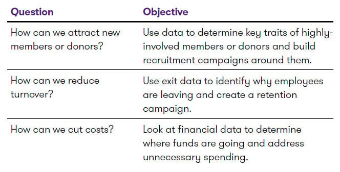
Putting theory into practice
As a result of COVID-19, Charity XYZ has been forced to forgo many of its in-person fundraising practices—and it’s seen a huge dip in fundraising dollars. Its goal, therefore, is to answer the question: How can we bolster donations and find a way to get back to pre-COVID-19 levels? In this context, its objective is to use data to identify attribute(s) that influence an individual’s willingness to donate and build a donation campaign around these traits.
Step 2: Determine your data set
After you decide on an objective, you need to zero in on the data points that will best help you achieve it. To do this, you need to craft a list of specific questions designed to guide the data collection process. So, for instance, in addition to asking your broad objective question—such as, “How can we bolster donations?”—you’d be well-served to get a little more granular and ask: “What key factors might affect donations?”
This type of exercise makes it easier to understand what type of data you’re looking for. Typically, the data you use will be classified as either internal, external or newly-developed—and you’ll often require a combination of the three to effectively find the answers to your pressing questions.
To understand what we’re referring to, let’s explore some common sources of data in a little more detail.
Internal data is data that can be found throughout your organization and may include membership databases, financial reporting information or registration data for events. Things such as donor geographic areas, average income of donors, or other general information could help you find patterns in donor behaviour.
|
GT tip: When selecting your data, try to think outside the box. What indirect insight can you glean from your internal data? Remember, different parts of your organization might collect different types of data you’re not aware of. For example, your marketing team might track one thing and your operational team, another. |
External data, meanwhile, is data from an external body or organization, such as Statistics Canada. Combined with your internal data, this can provide new insights to help you answer a range of questions. If you have a geographical market where a lot of your donors reside, you could leverage information from Statistics Canada to find the average income level of the region.
|
GT tip: There are countless places to find external data—from weather resources to social media posts. The key is to make sure it supports your original objective. Most importantly however, ensure that the way you utilize the information collected from individuals is disclosed, per PIPEDA regulations. If you’re unsure, speak with your legal team. |
Newly-developed data is data that must be collected to achieve your desired objective. It can be as simple as adding an extra line on a registration form or as complex as launching a poll of a specific demographic. For example, if you run a cancer-focused charity, you may want to conduct a poll to determine which percentage of your key donors have incidences of cancer in their families.
|
GT tip: A professional can help you determine which data set—or combination of data sets—will uncover the knowledge you’re looking for. |
Putting theory into practice
Charity XYZ is on a tight timeline and a tight budget. Because external data and newly-created data can be more costly and timely to attain, it opts to rely most heavily on its readily-available internal data to achieve its objective. Specifically, it leverages its extensive donor database to zero in on donations made over the last five years and assess how those donations may have linked to geographical areas, age groups or average incomes.
Step 3: Clean your data
Very often, the data collected by organizations is filled with mistakes, errors and incomplete values—which makes it very difficult to accurately analyze it. As such, this “dirty data” needs to be scrubbed, which can be a very tedious and meticulous task.
To effectively clean your data, you’ll need to:
- Normalize your data. This involves going through each item and making sure it’s described and spelled the same way. It also includes removing acronyms and correcting spelling errors.
- Focus on format. In this context, you want to ensure things like dates, subtotals, blank rows and columns are correctly (and consistently) displayed.
- Address missing fields. Often, fields in an entry will be left blank—and you’ll be missing certain things like email addresses, job titles and addresses. In this situation, you want to fill in whatever data you can but, when you can’t, you need to have an approach for handling them. This can include ignoring the field altogether, creating a new category for “unknown” or making an assumption on that field.
- Merge data sets. If you decide to use multiple sources of data, you’ll need to connect these data sets together. When you do this, you’ll once again have to make sure that all data is normalized and formatted consistently.
While it is ideal to have perfectly clean data, remember that using a moderately clean data set can still yield insight—you’ll just have more outliers to remove.
Putting theory into practice
Charity XYZ’s data turns out to be relatively clean—except for a few segments. The most problematic area comes from the information provided at sign-up. The charity would like to determine which age groups are more inclined to donate. The trouble is, some individuals left the field blank. Fortunately, Charity XYZ recognizes that data sets don’t have to be 100 percent perfect to be effective—you just need to get the most accurate data possible. In this scenario, the charity simply scrubs the data to ensure all applications with blank age fields are skipped, and still has enough information to detect key patterns.
Step 4: Analyze your data
There are numerous tools available to mine data, but Microsoft Excel can be a great one to start with. Not only do most organizations have it easily on hand, but it offers a plethora of functionality, most of which can be learned through a quick YouTube tutorial.
Once you have your tool selected, it’s time to mine your data. “Mining” involves finding correlations or relationships that can help you achieve your objective. Essentially, you want to see if data patterns in areas like wealth, age group, marital status, education—or any other relevant data set—could potentially help you find an answer to your original question. You may also want to look at how these different data sets are interrelated.
To make these patterns easier to identify, it’s helpful to plot your findings on a graph. If you notice a possible correlation or relationship, you will then want to work backwards and figure out the reason behind the patterns.
Figure 1
For instance, in Figure 1, we can see that age is influencing donations--but why is that the case? What are all the possible explanations for this trend?
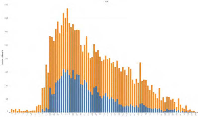
One way to answer these questions—and get even greater data insights—is by layering other factors into the same graph.
Figure 2

For instance, in Figure 2, we layer in wealth, which gives us a more in-depth picture that may offer different insights into our donors’ decision-making.
After understanding what and why something has happened, you may want to know under your current or future circumstances what your membership conversion rates will look like if a person is in a favorable age group but an unfavorable geography? This is called “predictive analysis” and, although challenging, it’s one of the most valuable pieces of insight data analytics can offer.
Putting theory into practice
After plotting all donor information in an Excel spreadsheet, Charity XYZ creates a couple of different charts. The first displays donation rates by geography, as the charity wants to determine whether the most generous donors reside in a particular region. The second chart layers in donations by age and wealth. The point here is to determine what age groups have a higher involvement rate than others—and if so, to uncover why.
Essentially, Charity XYZ needs to answer three basic questions to create an effective donor campaign:
- Which demographic is the easiest to engage?
- How can we best target this demographic?
- Where should we focus our efforts and resources?
In answering these questions, Charity XYZ looks at its data and determines that the age group of 50 – 55 in southern Alberta was the most inclined to donate last year. After further exploration, it finds that the charity’s Calgary branch held a rather successful online fundraising event and silent auction which seemed to resonate well with this age group.
Armed with this information, as well as data collected from other regions across the country, Charity XYZ decides to create a similar event on a much larger scale. With evidence of its previous success, it is able to attract better prizes for the silent auction and justify a larger spend to promote the event. In the end, the cross-Canada fundraiser is a tremendous success—and helps the charity raise a record number of donations and attract new donors at the same time.
It’s worth noting, here, that this is merely a hypothetical example. If your organization hopes to achieve this same objective, you’re going to have to conduct tests to see what will work for you. The more data you have, the better decisions you’ll be able to make. The steps outlined can act as a starting point but may not apply to every situation. If you’re unsure of what steps to take it may be worthwhile for you to seek assistance in developing your data analytics plan.
The path forward
As you see, data analytics can provide invaluable insights to help you resolve some of your most pressing organizational challenges. And while it may not be an easy undertaking, by breaking data analytics into these four basic steps, you can start to understand the value it provides and the role it can play in helping you become a more agile organization.
If this is something you’d like to explore further, our experienced Data Analytics team would be happy to guide you through the process. Please reach out with any questions you may have—or if you’d like to learn more about the value, we can add to the data analytics process.
Grant Thornton’s communications are intended for informational purposes only and do not constitute advice or an opinion on any issue. We would be please to provide additional details or advice about specific situations if desired.

